Quiet Luxury Meets Bold Color: Finding Your Balance
Refined. Radiant. Unforgettable.
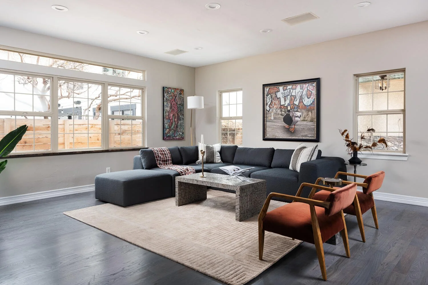
In 2025, “quiet luxury” is everywhere—from fashion to interiors. Think understated elegance, quality over flash, and timeless design that whispers sophistication. But what if your vibe—like ours—is known for vibrant palettes and bold personality?
Good news: quiet luxury and bold color aren’t opposites. In fact, when done right, they elevate each other.
What Is Quiet Luxury?
It’s not about being boring or beige. It’s about intention. Quiet luxury focuses on:
High-end materials (think linen, velvet, marble, walnut)
Tailored design that feels custom and personal
Simplicity with soul—every element feels curated, not cluttered
Where Bold Color Fits In
The trick is to use color as a moment—not to overwhelm the home.
One strong color story per room
A jewel-toned velvet sofa. A rich green gallery wall. A saffron-hued artwork. Let one tone lead, and let the rest of the room breathe.Pair color with luxe textures
Bold cobalt becomes even more powerful against soft cashmere throws or brushed gold accents.Let the architecture speak
In a staged or designed space, quiet luxury often means showcasing natural light, moldings, and layout. Use bold color to highlight—not hide—those features.
Design Tip: Drama + Discipline
In our recent projects, we’ve been layering:
Earthy neutrals with bursts of citron or amethyst
Warm minimal backdrops with saturated abstract art
Deep navy or espresso walls with polished chrome and sculptural lighting
This creates contrast that feels expensive—not overwhelming.